![]()
Whether it is a website, an APP or a product design, proper negative space is necessary. If your website is overly busy and complex, such as filling all space with contents, your potential customers will be hard to concentrate, and your brand may soon lose their attention. Thus, a good negative space design can be said as an integral for user experience, as well as the best supporting tool to highlight your promotional content. Next, we will demonstrate the importance of utilising white space in UI design.
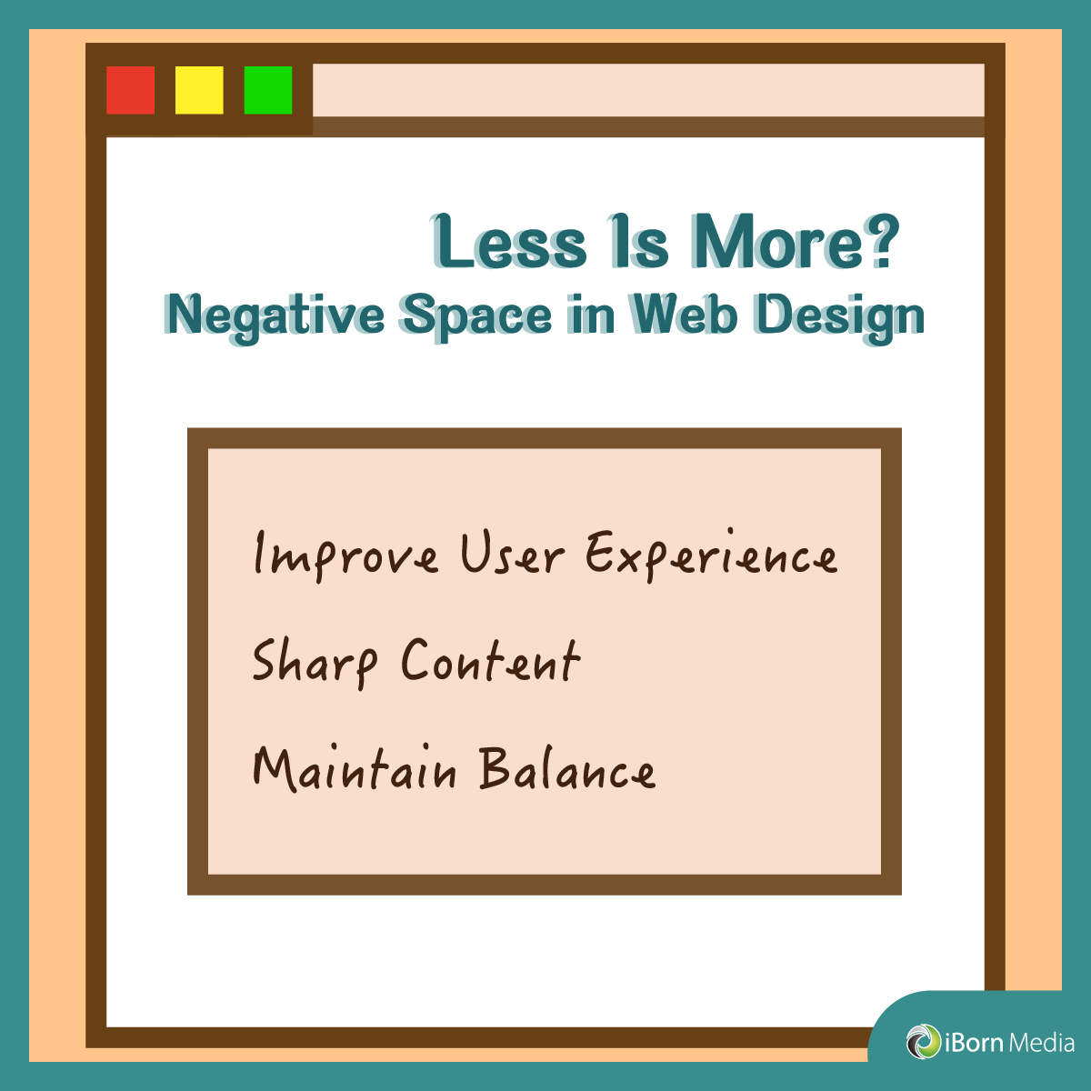
1.Improve User Experience
It is extremely crucial to make your website easy to read. If it looks cluttered, your customers will be more fatigued when browsing the web, and then stop paying attention to your words. To make it readable, we need to add negative space appropriately, such as adding blank elements in terms of content length, images, and layout spacing. This guides your visitors’ eyes to the main message instantly, hence enhancing the user experience.
2.Sharp Content
Customers’ attention and memory are often limited and selective. Therefore, the key for you to stand out from the competition lies on whether you can attract others attention in a short period of time. Using Apple’s website interface as an example, we can see that it uses a blank background to form a sharp contrast, which in turn, visualises their main product. Though there aren’t many words describing the product, such tidiness and unity can easily draw the focus of your visitors by decreasing messy elements.
3.Maintain Balance
Excellent web designers allow users to find out what they want without using their brains. Take Google’s searching page as an example. The entire interface retains only a few commonly used functions and the search bar. In this sense, visitors can be immediately directed to the operable areas of the page, such as Gmail, pictures, or direct search. It deliberately maintains simplicity and balance, maximizes the user’s browsing speed, and succeeds in creating active interactions.


